ShopDreamUp AI ArtDreamUp
Deviation Actions


Description
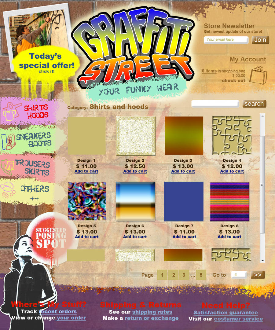
A practice for web design. The concept is an online clothing store selling teens wear with graffiti and funky style. Don't mind the texture as the design sample, it should be the shirt photos  Crits and comments are very welcomed!
Edited:
Not much changed with the layout but the texture has changed quite a bit and I've added more detail to them. Finished the logo and all the comment about the logo can go to [link]
Used a few photo texture from sxc.hu: the photo on top left, the graffiti on bottom left, the spray dot and a random graffiti.
Image size
1280x1536px 630.18 KB
© 2009 - 2024 shukugumo
Comments30
Join the community to add your comment. Already a deviant? Log In
I'm going to be a bit harsh on this one since I found this design quite... unmatched with the concept. Before I go with the critics, I'll say good job with the background and the Store Newsletter part on the upper right part of the screen, it is fit quite nicely with this color scheme.
Now on with the critics:
First, the logo. I know you said the logo is kinda lame and you'll redo it later but I should remind you that logo is the most important part for the first sight, that means you should finalize the logo first before doing anything else. Any visual styles should be based on the logo so you can have "consistency" for your overall design. So, finalizing the others without finalizing the logo first in my opinion is a fatal mistake, and you could be doing the entire design all over again if the logo was revised. And you mistyped the Graffiti typo there. It was called Graffiti, not Grafitti (double F not double T). I don't mind if it's on artist comments but inside the logo, it's a very important one, even the client might not pay you for your effort if he seen this kind of mistake.
Now the consistency here is quite messed up. You have simple colors for the logo, while the background texture (the brick and the textbook papers) is detailed, while the store newsletter in the upper right is a simplified (undetailed) orange paper. I know I'm saying that this part is fit quite nicely with the color scheme, but I'm not talking about the color scheme here. It's inconsistency that I'm talking about. And forget the smiling face on the logo, I can't find any valid purpose for it to be there.
Second, the overall theme. Remember you are using english language and I see below there is "Shipping" word, that means you plan to make the business go internationally. That means you have to research again what is the standard for graffiti for international class. Because from what the text "graffiti" and smiley face in the logo is more like a childish doodle (sorry) than a real graffiti. That goes for the textbook paper on the background as well, the textbook paper is very much Indonesian, if you plan to make it international, you should use a paper that most people in the world familiar with.
On a second thought, a school textbook is not suitable for the "funky" idea. I might be wrong, but I'm guessing "Funky" here means "Lots of Fun" more or less, and for most students of your target found school as "Boring" rather than "Funky", and they tend to avoid School-themed products for that. Besides the textbook paper and the graffiti is far of being matched. Have you seen graffiti on paper? I never saw any of them. graffitis are on the walls and other hard-surfaced objects, not papers.
If you decided to follow what I said here, you're going to modify the entire design, probably creating them from scratch. If you are going to do that, focus on the graffiti part, with the right graffiti style, you could grasp the funky part within the graffiti. I know graffiti is somewhat have low legibility but that's the challenge if you're using graffiti theme, it's their true nature.
For the final note, please do research first about the theme and anything possible related of the theme that related to your design that you will make. The possibilities that related to the theme might be countless, and you'll probably don't have time for that. If you ask how could you do it, try limiting the possibilities by drawing a mind mapping diagram, then you wrote out whatever possible related to the theme here, after you got so much, scratch out anything that you find unacceptable in your design. After ruling out many things, you should find the most suitable possibilities related to the design there, then you could start researching those possibilities, as understandable as possible. If you're aiming for awesome output, don't start before you really know inside and outside of what you are planning to make. Might this critique help you improving your design further.